
 When working with small text it’s best not to use colours which contain more than one ink. All printing presses have a tiny variation in the positioning of the different colour printing plates. It’s fine to use coloured text in headlines or type above, say, 10 point, but below that the blurring may be noticeable. The same thing happens when you knock white text out of a coloured background made from more than one ink.
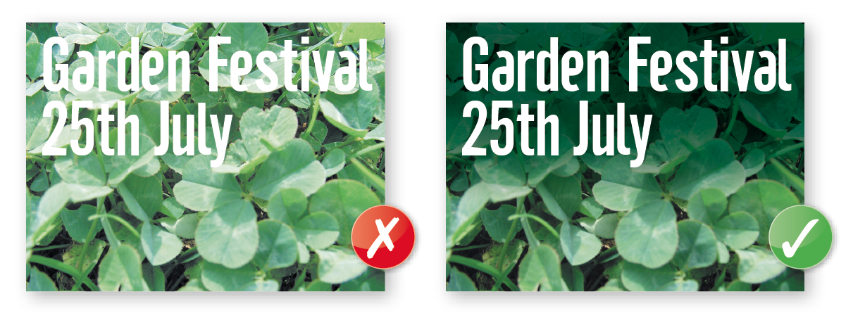
Be careful if you are putting text over a photographic background as the text may be hard to read. To overcome this you may want to lighten or darken the image in an image editing package such as Photoshop. You may need to adjust the image more than you expect – always think to yourself “is it more important to see the image, or read the text?” If the text is more important, it may be best not to put it over the photograph at all.
 It’s fine to convert headlines and large text to curves, paths or outlines (which means that you won’t need to supply the fonts).
We really advise against setting text in a bitmap application like Adobe Photoshop® – the text will not be nearly as clear as if it were vector text from Adobe Illustrator® or Adobe InDesign®Also, Photoshop® by default does not apply any trapping, and thus the chances of mis-registration are increased.
We’d recommend that you keep your text above these minimum
sizes for each product:

 Print this page